
Home Assistant Release 2022.11
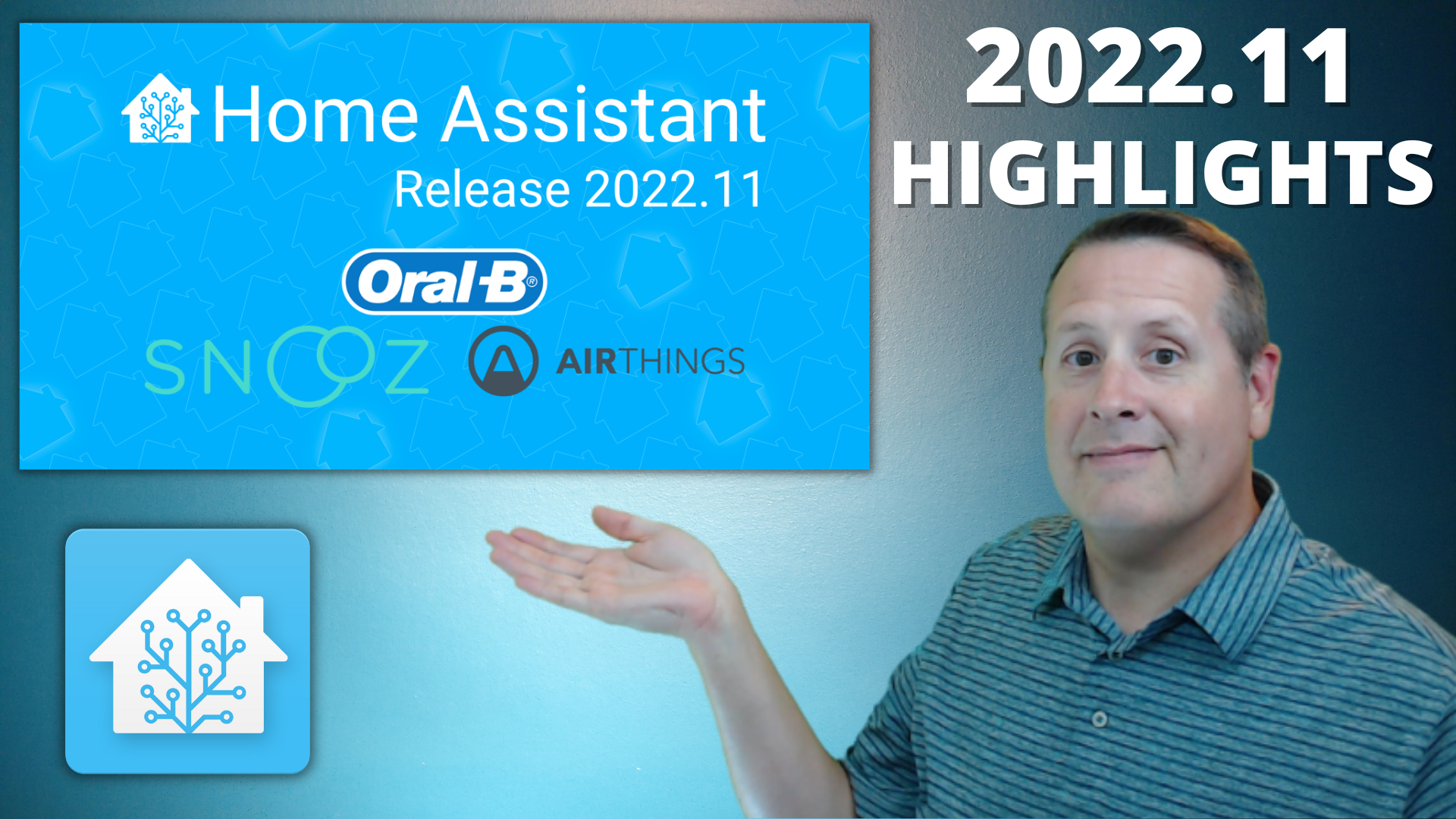
Home Assistant version 2022.11 is now released. With that, some of your WTH (What the Heck?) suggestions and feedback have been introduced. If you don't know what WTH is, it's a month in which the Home Assistant team takes in suggestions and feedback outside of normal PR requests. It's an open forum for asking "What the Heck" to the Home Assistant team.
Notable in this release is the following:
- Tile Card
- Statistics Card
- Smart Automation and Script Reload
- Water Usage Stats
- Color Temps now in Kelvin
- Updates to the "More Info" Screens
- Set first day of week to your preference
- New Templating Features
- UI Changes for Material Design 3 guidelines
I'll cover a few of these and you can see the rest of my overview in my video.
Tile Card
The tile card is the start of new style cards that will be released in Home Assistant. It is used to show a quick overview of an entity. Clicking the icon will toggle the entity while clicking other areas of the card will bring up a "more info" dialogue.
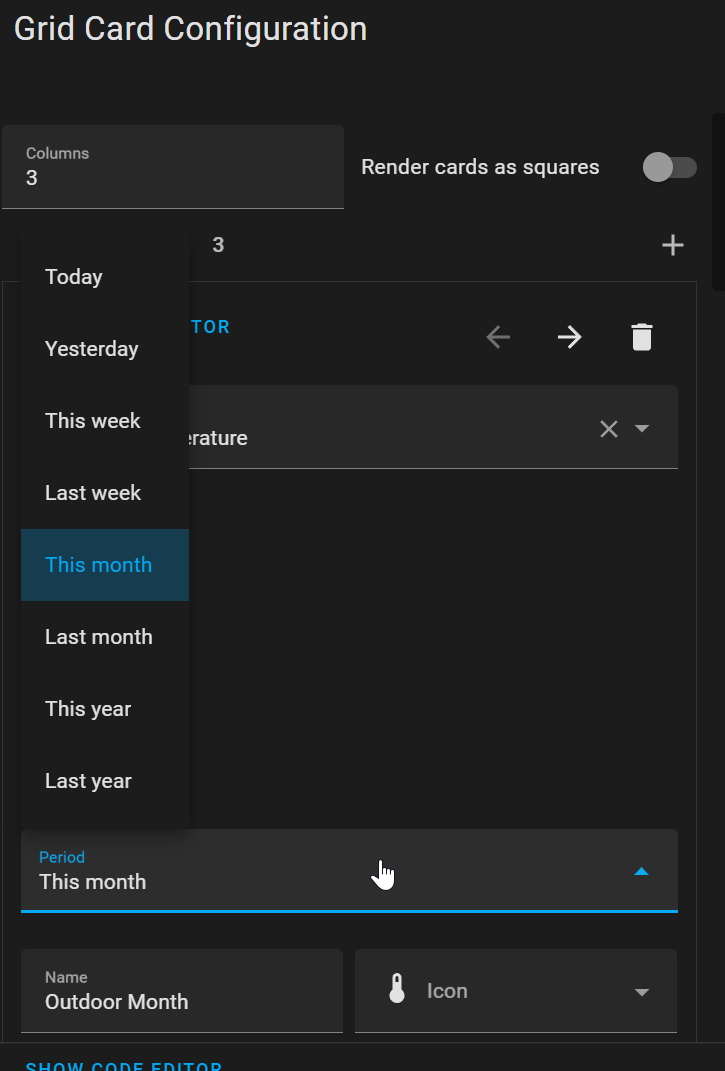
Statistics Card
The statistics card (just as hard to type as to say) is used to show a single value of an entity over time, rather than viewing the full statistics graph. You can view Min, Max, Median, and Change. Not all options apply to all entities. You can also choose the period of time the value applies to. I can see many uses for this feature!
Water Usage
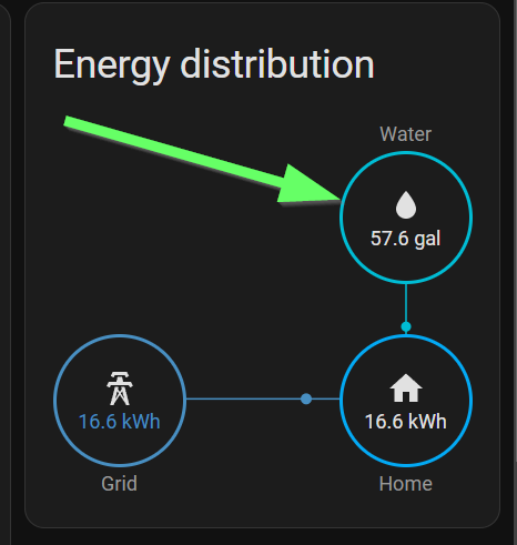
Being able to monitor water usage along with energy was a big request in the WTH month. Although water usage is not technically energy, it can be used in conjunction with other energy usage to formulate overall consumption of commodities, so it makes sense to have it as part of the energy dashboard.
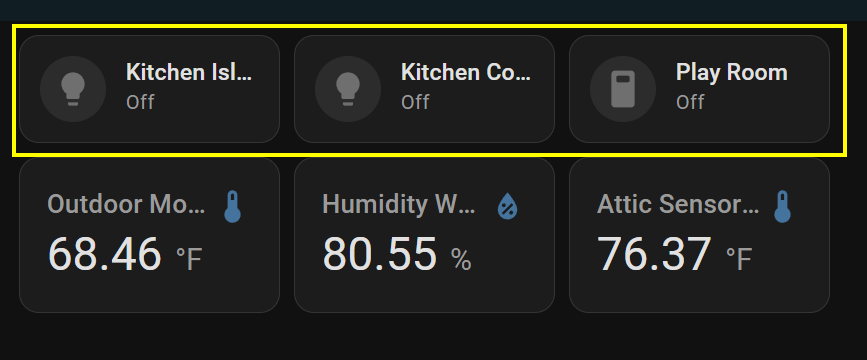
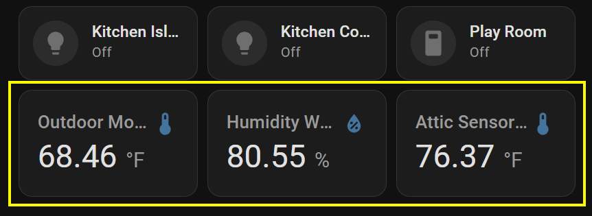
UI Design Changes
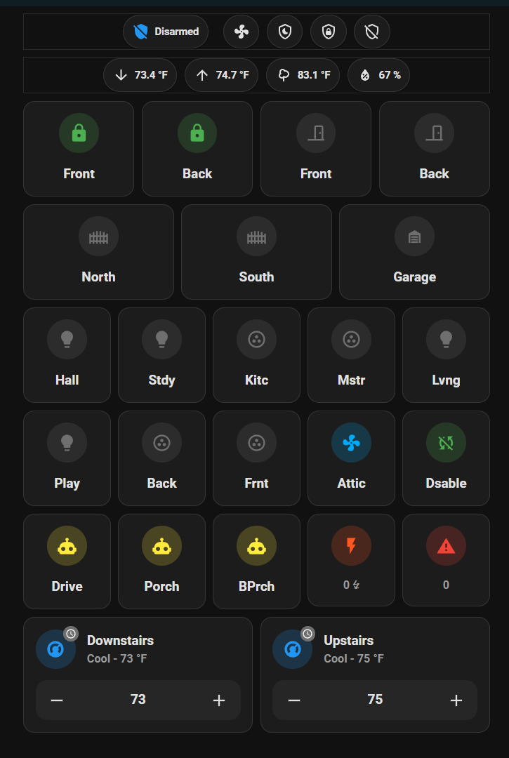
This is probably the most notable visible change in this release. Once you update and reload your screens, you'll see your square buttons all become a bit rounded. As you can see above, everything has slightly rounded corners. If you are used to everything fitting neatly together, the rounded corners play with the eyes just a bit and make things a bit more spread out, at least to me. It will take me a bit of getting used to, but in the end, it will probably turn out better.
Another thing is that everything has a tiny bit of border. This makes it easier to hit the exact spot for a smallish button as the button's area is clearly defined. It is also putting borders around the top two rows of mushroom chip cards, which I'm not a fan of. There might be a setting to disable that so I'll have to play around a bit.
Well that's going to do it for this article. There is more to the release and you can view my video to get the stuff I haven't covered here. Thanks for stopping by, reading this far, and hopefully watching the full video on YouTube.