Add Custom Button Cards to your Dashboard

In my opinion, one of the most useful dashboard elements in Home Assistant is the Button Card by @RomRider. Why do I say that? The feature list alone tells the story. Take a look at what you get with Button Cards as listed on the GitHub page:
- works with any toggleable entity
- 6 available actions on tap and/or hold and/or double click:
none,toggle,more-info,navigate,urlandcall-service - state display (optional)
- custom color (optional), or based on light rgb value/temperature
- custom state definition with customizable color, icon and style (optional)
- custom size of the icon, width and height (optional)
- aspect ratio support (optional)
- Support for javascript templates in some fields
- custom icon (optional)
- custom css style (optional)
- multiple layout support and custom layout support
- units for sensors can be redefined or hidden
- 2 color types
icon: apply color settings to the icon onlycard: apply color settings to the card only- automatic font color if color_type is set to
card - blank card and label card (for organization)
- blink animation support
- rotating animation support
- confirmation popup for sensitive items (optional) or locking mecanism
- haptic support for the IOS companion App
- support for custom_updater and HACS
The Button Card is installed using HACS (or manually). My preferred method is with HACS since it makes installing and keeping up with updates easy. I didn't include the installation instructions in the video but they are easy to follow.
If you are not familiar with HACS, take a look at my Home Assistant Basics Part 3 video for an explanation and how to install and use HACS.
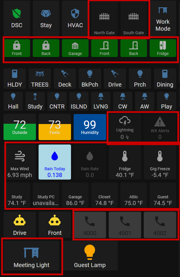
I use quite a few Button Cards in my dashboards. For just this one section of my office tablet dashboard, all the elements outlined in red below are Button Cards.

Obviously, I'm a big fan. There are so many things that can be done with these buttons to tailor them to exactly what you want. It makes building out custom dashboards possible. Although there are many different configuration options, they are not hard to use. You can be as simple or as complex as you choose.
There is some YAML involved in these cards as the UI editor doesn't have the ability to customize them directly. Don't let that scare you though. If you have been curious about YAML and want to learn more, take a look at this sponsored link and sign up for Skillshare. If you are one of the first 1,000 to sign up, you'll get the first month free! They have courses on YAML that will walk you through the basics.
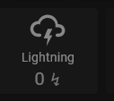
Here is an example of the configuration for one of my button cards. This is the lightning detector card. This card will turn yellow once there are at least 10 lightning strikes detected and will turn red and flash continuously when that number reaches 250 strikes.
type: custom:button-card
entity: sensor.blitzortung_lightning_counter
name: Lightning
icon: mdi:weather-lightning
tap_action:
  action: more-info
show_state: true
styles:
  card:
    - filter: opacity(50%)
    - height: 80px
  icon:
    - color: white
  name:
    - font-size: 12px
    - color: white
state:
  - value: 250
    operator: '>='
    icon: mdi:weather-lightning
    styles:
      card:
        - background-color: red
        - filter: opacity(100%)
        - height: 80px
        - animation: blink 3s infinite
      icon:
        - color: black
      name:
        - color: white
      state:
        - color: white
  - value: 10
    operator: '>='
    icon: mdi:weather-lightning
    styles:
      card:
        - background-color: yellow
        - filter: opacity(100%)
        - height: 80px
        - animation: blink 3s ease
      icon:
        - color: black
      name:
        - color: black
      state:
        - color: black
                ```
For more examples and a walk-through of some configuration options, make sure to watch my video on YouTube. 👇👇👇
